How to Choose Blush Shade for Your Skin Tone: The Complete Matching Guide
Choosing a blush shade can feel like guesswork — the color that looks perfect in the pan disappears on your skin, or the shade a friend swears by looks completely wrong on you. The reason is simple: blush doesn’t exist in isolation. It interacts with your skin’s depth (how light or deep your skin is) and your undertone (the subtle hue beneath the surface). Get those two variables right, and shade selection becomes straightforward.
This guide walks through finding your undertone, matching shades to fair, medium, and deep skin, how to swatch properly, and the common shade mistakes to avoid. If you’re new to blush overall, our complete [blush guide for beginners → blush-guide-for-beginners] covers formulas and application technique.
Key Takeaways
- Your undertone (cool, warm, or neutral) matters more than any other factor in blush shade selection.
- Cool undertones glow in berry, mauve, and blue-based pinks; warm undertones glow in peach, coral, and apricot.
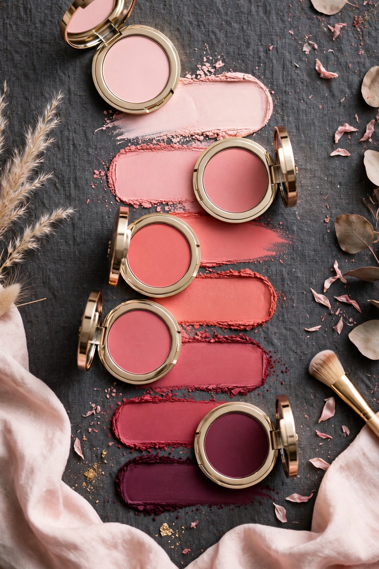
- Fair skin suits soft, sheer shades; medium skin suits rose, mauve, and terracotta; deep skin suits rich berry, brick, and vivid warm tones.
- Always swatch on your jawline or cheek in natural daylight — store lighting lies about color.
- When in doubt, choose the shade closest to your natural flush (the color your cheeks turn when you exercise).
- The right [formula for your skin type → cream-blush-vs-powder-blush] makes any well-chosen shade look better.
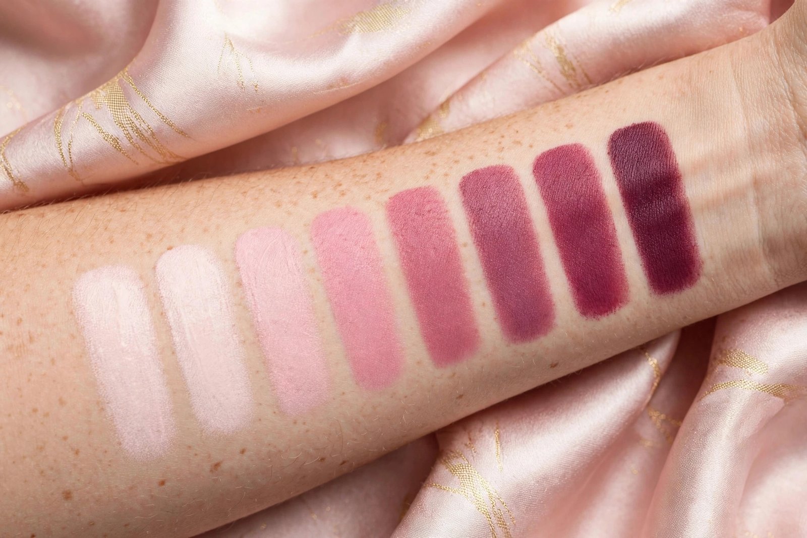
Step 1: Find Your Undertone
Undertone is the subtle hue beneath your skin’s surface — and unlike your surface skin tone (which changes with sun exposure, seasons, and redness), your undertone stays constant for life. There are three: cool, warm, and neutral.
Cool undertone: Skin has pink, red, or bluish hints. You likely burn rather than tan, look best in silver jewelry, and find that blue-based reds and jewel tones flatter you in clothing.
Warm undertone: Skin has yellow, golden, or peachy hints. You likely tan easily, look best in gold jewelry, and find that earth tones, oranges, and warm reds flatter you in clothing.
Neutral undertone: A balanced mix — neither strongly pink nor strongly golden. You can typically wear both silver and gold jewelry, and most colors look fine on you.
Three reliable tests (use natural daylight, not indoor lighting):
-
The vein test. Look at the veins on the inside of your wrist. Blue or purple veins suggest cool undertones. Green veins suggest warm undertones (the green appearance comes from yellow-toned skin over blue veins). A mix of blue and green suggests neutral.
-
The jewelry test. Hold silver and gold jewelry (or fabric) against your face in daylight. Which makes your skin look brighter and healthier? Silver flattering you = cool; gold flattering you = warm; both looking good = neutral.
-
The white vs. cream test. Hold a pure white cloth and a cream/off-white cloth against your bare face. Pure white brightening your skin = cool undertone. Cream looking better = warm undertone. Both working = neutral.
No single test is definitive — use at least two, and go with the majority result. If you’re still unsure after all three, you likely have a neutral undertone, which is the most flexible category anyway.
Why undertone matters more than depth: A cool-toned deep skin and a cool-toned fair skin will both look best in the same families of blush (berries, blue-pinks, mauves) — just at different intensities. Get the undertone family right first, then adjust depth within it.
Step 2: Match Shades to Your Skin Depth
With undertone established, narrow down by how light or deep your skin is. These are guidelines, not laws — personal preference always gets a vote.
Fair to Light Skin
Best bets: Soft pink, light peach, sheer rose, baby pink, pale coral.
Fair skin shows blush color intensely — a little pigment goes a long way. Sheer, buildable formulas are your friend; highly pigmented blushes can look harsh before you’ve even finished blending. Soft pinks with cool undertones (for cool skin) and light peaches (for warm skin) mimic a natural flush most convincingly.
Shades to approach carefully: Deep berries, vivid oranges, and dark brick tones. These can work for evening looks, but they require an extremely light hand on fair skin — apply with a stippling technique and blend thoroughly. Neon-bright pinks can also look artificial against very fair skin in daylight.
Pro tip for fair skin: If a blush looks intimidating in the pan, it probably needs sheering out. Apply with a fluffy brush using a light touch, or choose gel and tint formulas that are inherently sheer.
Medium to Olive Skin
Best bets: Rose, mauve, terracotta, warm coral, dusty pink, berry-rose.
Medium skin has the widest range of flattering options. You have enough depth to carry richer color than fair skin, but not so much that sheer shades disappear. Rose and mauve are the universal workhorses — flattering across undertones. Warm medium and olive skin glows in terracotta and warm coral; cool medium skin glows in berry-rose and mauve.
Olive skin note: Olive skin (greenish-golden undertone, common in Mediterranean, Middle Eastern, Latin American, and South Asian complexions) can be tricky because it doesn’t fit neatly into cool/warm categories. Warm peaches, terracottas, and golden corals tend to harmonize best; very blue-based pinks can clash with olive’s greenish cast. When in doubt, terracotta is olive skin’s most reliable blush shade.
Shades to approach carefully: Very pale pastels, which can look ashy or chalky on medium skin, and extremely sheer formulas that may not show up at all. You generally need medium pigmentation for color to read properly.
Deep to Rich Skin
Best bets: Rich berry, brick red, vivid tangerine, deep plum, burnt orange, fuchsia.
Here’s the truth the beauty industry was slow to learn: deep skin can carry bold, saturated blush beautifully. Sheer washes of pale pink — the shades marketed as “universal” — often disappear entirely on deep skin or leave an ashy cast. Rich, pigmented shades show up as the luminous flush they’re meant to be. Don’t be afraid of color that looks intense in the pan; on deep skin, intensity translates to visibility, not clownishness.
Warm deep skin glows in burnt orange, brick red, vivid tangerine, and warm berry. Cool deep skin glows in fuchsia, deep plum, rich berry, and wine tones. Highly pigmented formulas (which deep skin can handle) in these families give that coveted lit-from-within radiance.
Shades to approach carefully: Pale pastels and anything described as “sheer wash” — these tend to look chalky or invisible. Also be cautious with brown-toned blushes that are too close to your skin depth; they can read as contour or muddiness rather than flush. The blush should be visibly different from your skin tone — that’s what creates the flush effect.
The Natural Flush Shortcut
If undertone tests feel abstract, here’s the simplest shade-matching method in existence: look at your own natural flush.
Exercise for a few minutes, step into the cold, or think of something embarrassing — then look in the mirror at the color that rises in your cheeks. That color, by definition, harmonizes with your skin. Find a blush that approximates it, and you have a shade that will look natural on you in any lighting.
This works because your natural flush is your undertone expressed — the blood beneath your skin tinted by the same undertones that determine your best shades. It’s personalized color theory, courtesy of your own circulatory system.
For a slightly more polished version of your natural flush (for evenings or photos), choose the same hue family one shade deeper or more saturated.
How to Swatch Blush Properly
Drugstore and beauty-counter lighting is designed to sell makeup, not to show you the truth. Here’s how to swatch so the color you buy is the color you get:
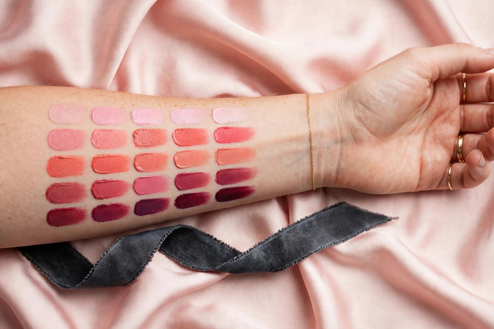
Where to swatch: The jawline or the apples of your cheeks — not the back of your hand or inner wrist. Hand skin is a different texture, tone, and undertone than facial skin; a shade that looks perfect on your hand can look completely different on your cheek. If hygiene or social comfort prevents cheek swatching, the jawline near the ear is the next best spot.
The daylight rule: Always check the swatch in natural daylight before buying. Step outside or near a store window. Indoor lighting — especially warm-toned retail lighting — makes everything look warmer, richer, and more flattering than it is. A blush that looks like a perfect rose under store lights may reveal itself as muddy brown in daylight.
How to judge the swatch: Apply a stripe, wait two minutes (cream and liquid formulas can deepen or change as they set), then assess: Does it look like a natural flush, or does it sit on the skin looking separate? Does it harmonize with your lips’ natural color? (Blush that echoes your natural lip tone almost always works.) Does it disappear into the skin at the edges, or leave a visible line?
The one-shade test: If you’re torn between two shades, swatch both side by side on the jawline. The right one will look like it belongs; the wrong one will look like makeup sitting on skin. Trust that instinct — it’s your eye recognizing undertone harmony.
Coordinating Blush With the Rest of Your Face
Blush doesn’t exist in isolation — it shares your face with eyeshadow, lipstick, and the rest. A few coordination principles:
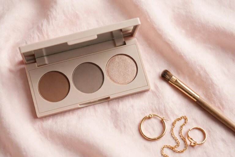
Match undertones across products. If your blush is warm (peach, coral), warm-toned eyeshadow and lipstick create harmony. If your blush is cool (berry, blue-pink), cool-toned companions work best. Mixed undertones across the face can look disjointed — not always wrong, but harder to pull off. Our [eyeshadow guide for beginners → eyeshadow-guide-for-beginners] can help you build coordinated eye looks.
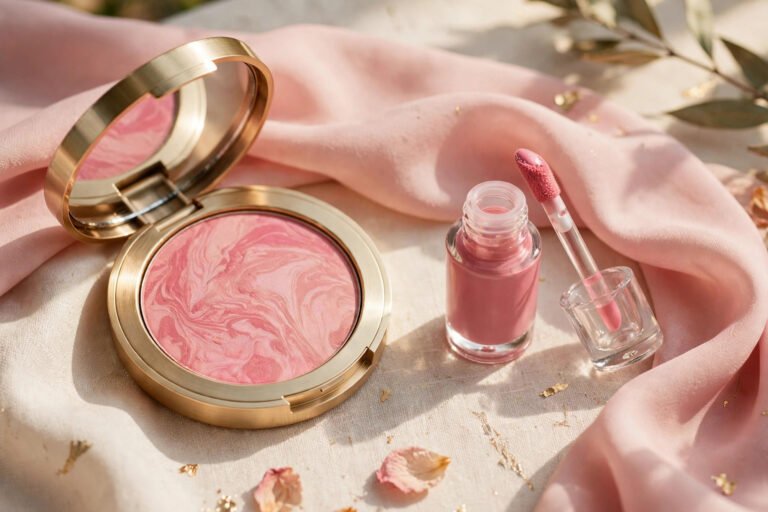
The monochromatic trick. Using the same blush shade (or the same color family) on cheeks, eyelids, and lips is one of the easiest ways to look polished. A matte blush swept through the eye crease, the same cream blush pressed on lips — everything coordinates because it’s literally the same color. This works in any shade family and flatters every skin tone.
Intensity balance. If your blush is bold, keep lips and eyes softer, and vice versa. One statement feature per face is the classic rule — a vivid fuchsia blush with a vivid red lip competes rather than complements. Bold blush plus neutral lip is striking; bold blush plus bold lip is a lot.
Common Shade Mistakes (and Fixes)
Choosing by pan color alone. The pan lies — or at least, it doesn’t tell the whole story. Pigment concentration, finish, and your skin’s interaction with the formula all change how a shade wears. Always swatch on skin.
Ignoring undertone. The single most common mistake. A warm coral on cool skin looks orange and disconnected; a blue-pink on warm skin looks harsh and artificial. When a blush looks “wrong” but you can’t say why, undertone mismatch is usually the culprit.
Going too dark too fast. Beginners often choose shades that are dramatic in the pan. Start with a medium-intensity shade in your undertone family — you can always go bolder later. Sheer-to-medium pigmentation is more versatile than maximum pigment.
Forgetting seasonal shifts. Skin depth changes with sun exposure. Your perfect summer blush may be too light for winter skin (or vice versa). Many people keep two blushes — a deeper shade for summer, a softer one for winter. Undertone doesn’t change, so stay in the same color family and just adjust intensity.
Matching blush to outfit instead of skin. Blush should harmonize with your complexion, not your clothes. A blush that matches your top but clashes with your undertone will look off all day; a blush that matches your skin works with everything you own.
Frequently Asked Questions
What blush shade is truly universal?
No shade is literally universal, but soft rose and muted terracotta come closest — they sit in the middle of the warm-cool spectrum and work at sheer application across many skin tones. That said, “universal” shades tend to be sheer, which means they may disappear on deep skin. Your best “universal” is the shade matched to your undertone and depth.
Should my blush match my lipstick?
They don’t need to match exactly, but they should be in the same undertone family and similar intensity. A warm peach blush with a cool blue-red lipstick clashes; a warm peach blush with a warm coral lip harmonizes. When in doubt, the monochromatic trick — same product on cheeks and lips — never fails.
Why does blush look orange on me?
Almost certainly an undertone mismatch: you’re likely cool or neutral-cool wearing a warm-toned blush. Orange-looking blush on the skin is the classic sign of warm pigment on cool skin. Switch to a blue-based pink, berry, or mauve and the “orange” problem usually vanishes instantly.
Can I wear shimmer blush, or should I stick to matte?
Both work — it depends on the effect you want and your skin texture. Matte blush gives the most natural flush and suits textured skin best. Shimmer or satin blush adds glow and dimension but can emphasize pores and fine lines. A good compromise: matte blush on the apples, a touch of shimmer blush or highlighter just on the high cheekbones. Avoid chunky glitter in blush at any age — finely milled shimmer only.
How many blush shades do I actually need?
One well-chosen shade in your undertone family covers 90% of situations. A second shade — either deeper (for evening/summer) or in a different finish (cream vs powder) — adds versatility. Beyond two or three, you’re collecting, not needs-based shopping. Invest in finding your perfect everyday shade first; everything else is optional.
Conclusion
Choosing a blush shade stops being guesswork once you know your undertone and skin depth. Cool undertones reach for berries and blue-pinks; warm undertones reach for peaches and corals; neutral undertones enjoy the full spectrum. Match intensity to your depth — sheer and soft for fair skin, rich and saturated for deep skin — swatch in daylight, and trust your natural flush as the ultimate reference.
With your shade dialed in, complete the picture: learn [where to place it for your face shape → where-to-apply-blush-face-shape], choose the right [cream or powder formula → cream-blush-vs-powder-blush] for your skin type, and if your skin runs dry, explore [hydrating cream formulas → best-cream-blush-for-dry-skin]. The full [beginner’s blush guide → blush-guide-for-beginners] ties it all together.
blush guide for beginners
cream blush vs powder blush
where to apply blush by face shape
best cream blush for dry skin
eyeshadow guide for beginners
Love this? Pin it for later!